Queer Fonts
Queer Fonts aims to push at the very boundaries of what can be considered type. If a series of signs cannot be read or recognised as letters, can it even be called a font? This project answers Yes. As we have seen, letterforms which were once legible are unrecognisable to modern readers, and characters which were once unreadable, can become legible in a matter years or even hours. However deeply embedded the convention is, legibility is not a pre-requisite for a typeface.
“That’s a hibiscus, isn’t it, Aunty?” Jaja asked, staring at a plant close to the barbed wire fencing.
“I didn’t know there were purple hibiscuses.”
Aunty Ifeoma laughed and touched the flower, colored a deep shade of purple that was almost blue.
“Everybody has that reaction the first time.”
The Typeface: Queery
Taking its inspiration from queer theory, Queery is
ambiguous, queer, defiant, subversive, and resistant to both
categorisation and legibility. It aims to disrupt the reading process
at the level of letterforms themselves and thus to challenge both designers
and readers who engage with it to see things differently.
If deep-rooted concepts like sex, gender and sexual attraction are up for
debate – and queer theory shows us they are – then surely the conventions
and boundaries surrounding type design are also open to disruption. A queer
approach seeks to show convention for the construct it is and highlight the
restrictions which necessarily accompany it. It asks ‘Why?’ of established
norms and ‘Why not?’ of suggestions outside of these. The goal of Queer Fonts
is to challenge the conventions of type design with no regard for utility or
function, or for legibility in the conventional sense – indeed, to challenge
the very concept of legibility.
Queer Fonts rejects the dominance of the market in the design process:
Queery's potential usefulness and commercial value are irrelevant.
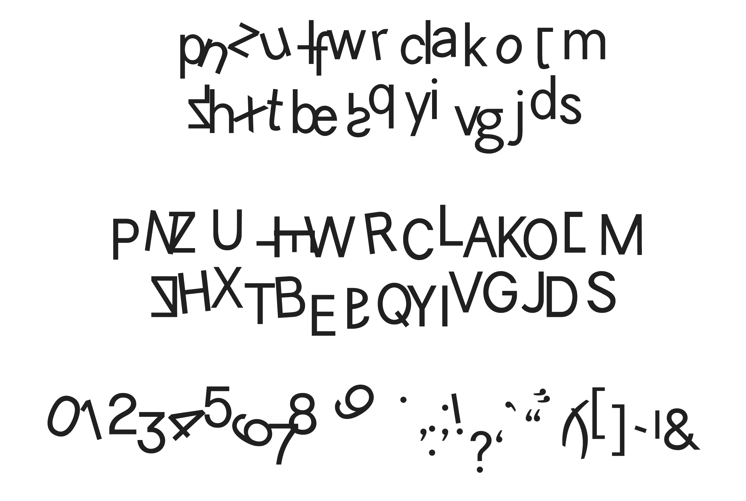
New Letterforms
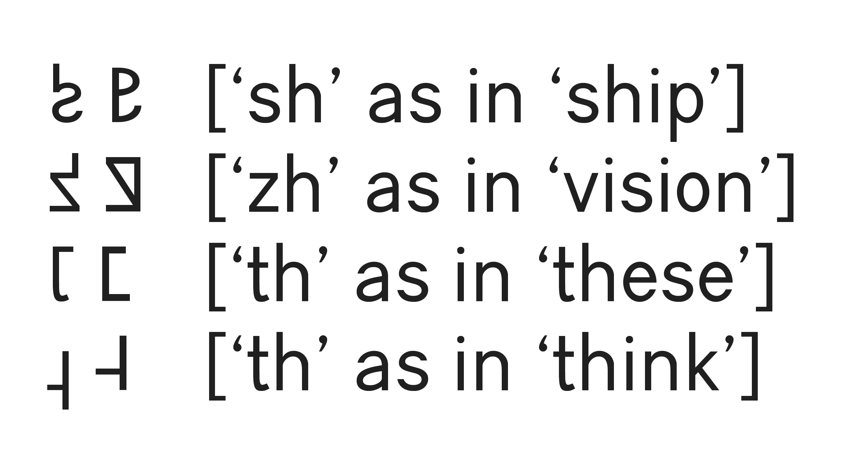
Queer Fonts posits the possibility of four new characters:
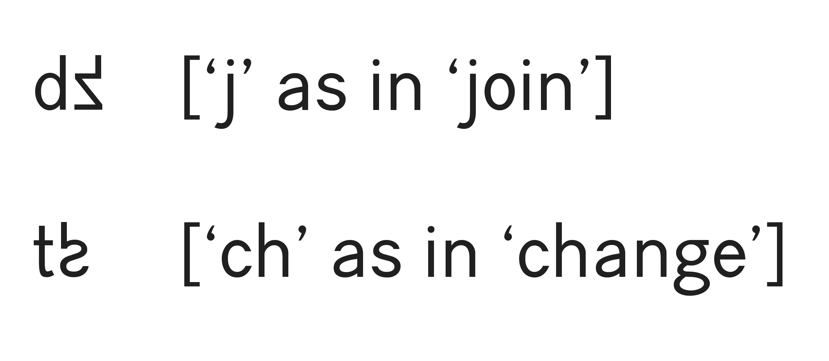
And new letter combinations:
Unconventional and Unnecessary Ligatures
Queery contains ligatures which no-one asked for.
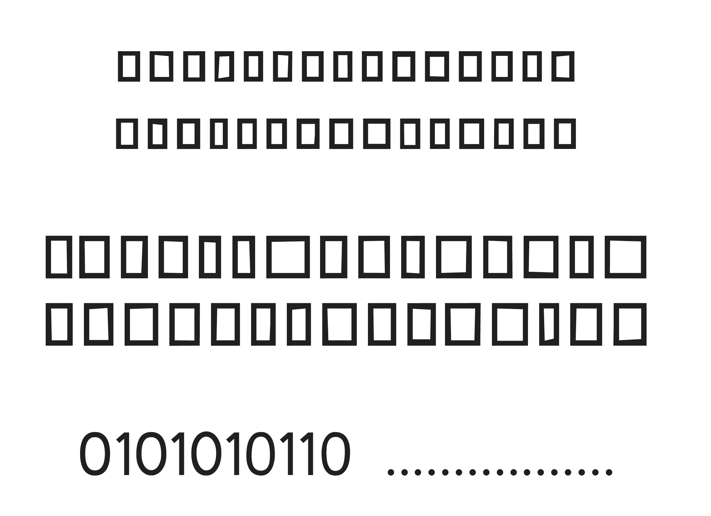
I don't owe you legibility.
I don't owe you legibility.
I don't owe you legibility.
I don't owe you legibility.
The Fonts
Normative
Reduced
Reshaped
Ambiguous